
English
English
Appearance
Greenland looks as big as Africa on almost every online map because those maps use the Mercator projection, which stretches land more and more the farther it lies from the equator. In reality Africa (about 30.4 million km²) is about 14 times larger than Greenland (about 2.17 million km²). Greenland's real area is close to that of the Democratic Republic of the Congo alone.
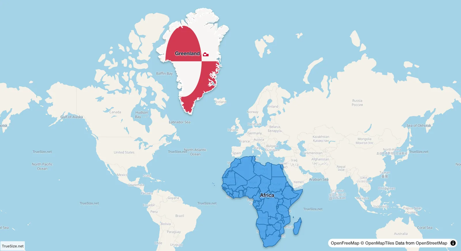
Greenland and Africa at their home positions on a Mercator map, the kind every web map uses. Greenland looks about as large as Africa.
A sphere cannot be flattened without distortion, so every flat world map gives something up. Gerardus Mercator published his map in 1569 for sailors. On it a ship that keeps the same compass bearing sails along a straight line, which makes courses easy to draw. To get that property the map has to keep every angle, and with it every small shape, correct.
On the globe, the circles of latitude get shorter toward the poles. At 60° latitude a circle of latitude is only half as long as the equator. But on a flat map the lines of longitude must stay straight and parallel, so every circle of latitude is drawn as long as the equator. East–west distances are stretched, by a factor of 1 divided by the cosine of the latitude. To keep shapes right, the map stretches north–south distances by the same factor at the same place. Area is stretched in both directions, so it grows with the square of that factor.
Almost every map on the web uses a variant called Web Mercator. It keeps shapes correct at every zoom level, so streets and buildings look right, and it stops at about 85° north and south because the stretch grows without limit at the poles.
| Latitude | Distances look | Area looks | Places at about this latitude |
|---|---|---|---|
| 0° | 1.0 times longer | 1.0 times bigger | Quito, Nairobi, Singapore |
| 20° | 1.06 times | 1.1 times | Mexico City, Mumbai |
| 30° | 1.15 times | 1.3 times | Cairo, Houston |
| 40° | 1.31 times | 1.7 times | Madrid, Beijing, New York |
| 45° | 1.41 times | 2.0 times | Ottawa, Venice |
| 50° | 1.56 times | 2.4 times | Prague, Kyiv |
| 60° | 2.0 times | 4.0 times | Oslo, Helsinki |
| 70° | 2.9 times | 8.5 times | Hammerfest, Utqiagvik |
| 80° | 5.8 times | 33 times | northern Greenland, Svalbard |
Greenland lies between about 60°N and 83°N. Its southern tip is drawn 4 times too large and its middle, near 72°N, more than 10 times too large. The northern end of the island is stretched even more. Africa straddles the equator, where the stretch is close to 1. That is why a country with one fourteenth of Africa's area looks as big as Africa.
The next five pictures show the 48 contiguous US states (about 8.1 million km²) moved from the equator to higher latitudes, with the grid switched on. The view has the same zoom in every picture. The country keeps its true size in all of them. Only the map's stretch changes.
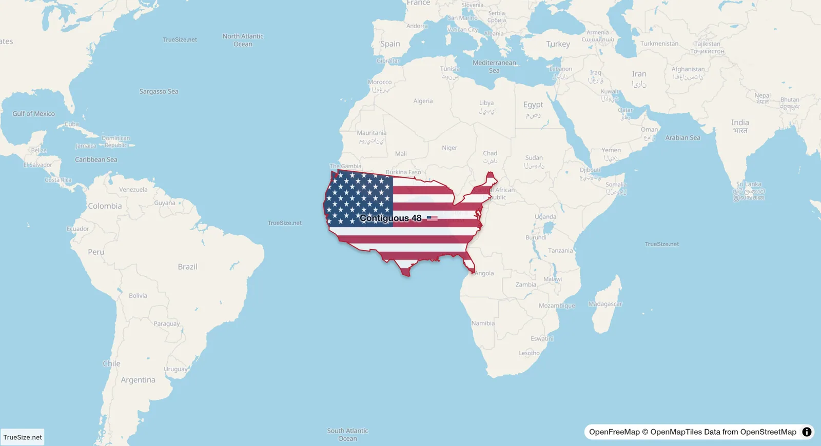
On the equator the map does not stretch anything.
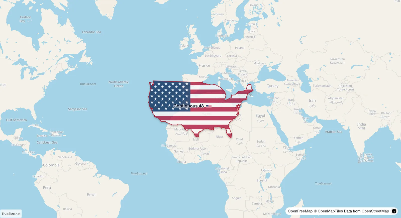
Centred on 30°N. The area factor there is 1.3.
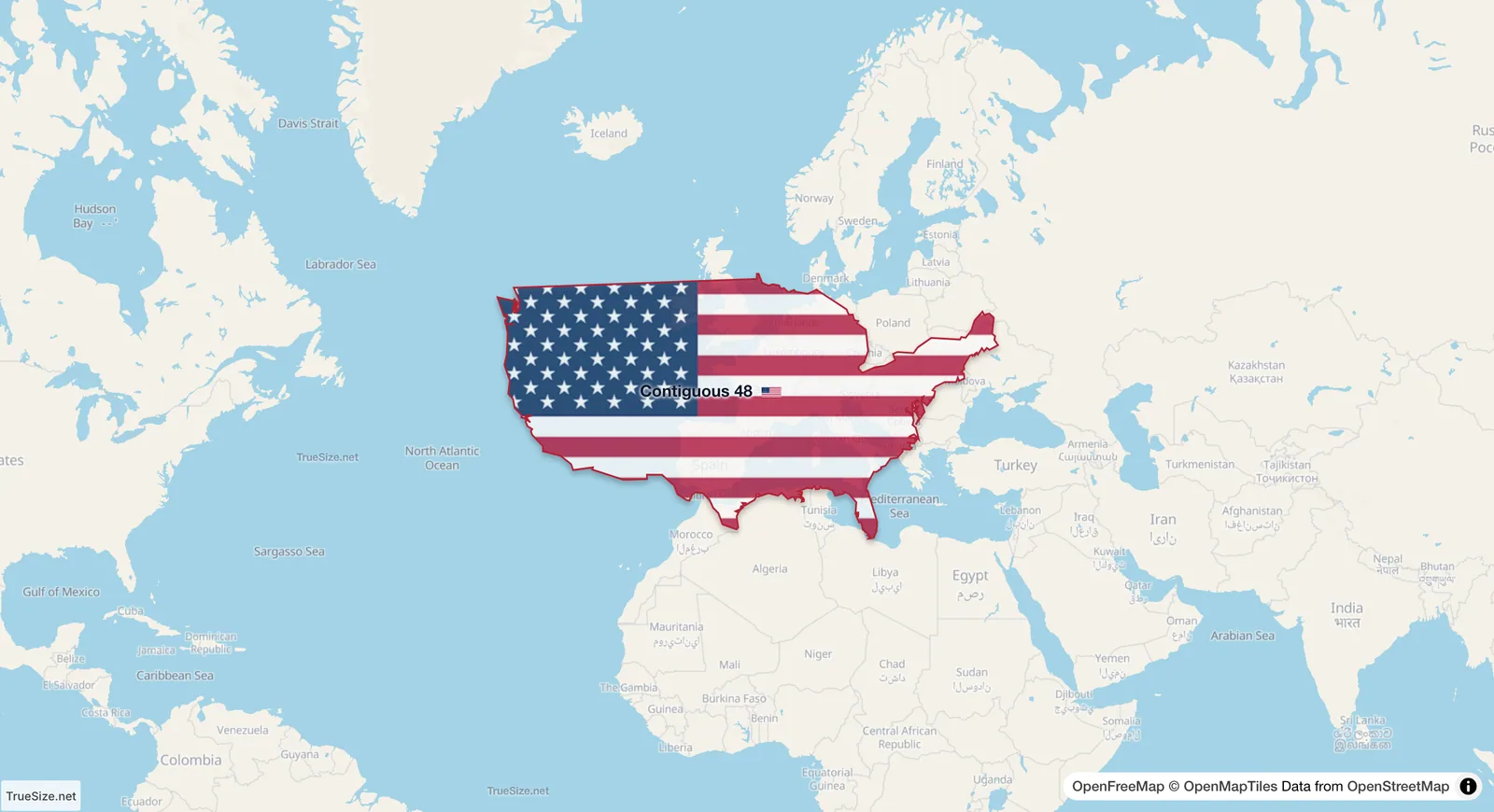
Centred on 45°N, where the factor is 2. The top of the shape reaches higher latitudes and is stretched more.
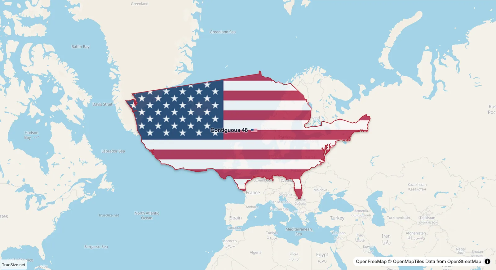
Centred on 60°N, where the factor is 4. The shape now looks about four times its size on the equator.
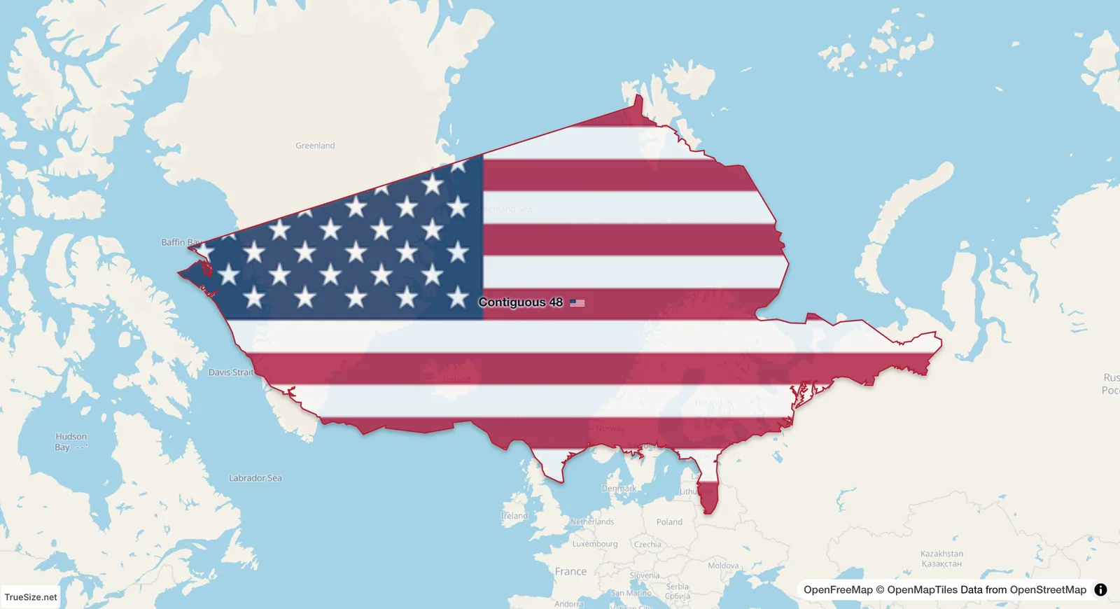
Centred on 70°N, where the factor is 8.5. This is the latitude of the northern tip of Norway and Alaska.
Moved beside each other on the same parallel, as in this picture, the difference is plain. TrueSize redraws a region for its new position, so at any latitude the area you see is its true area.
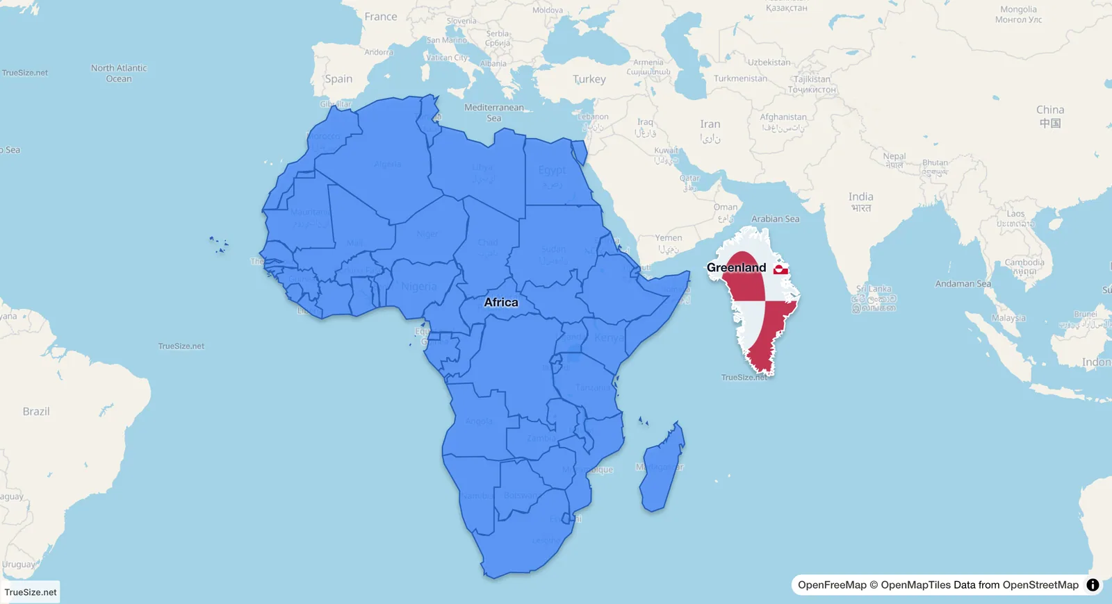
Greenland beside Africa on the same parallel, each at its true size.
Yes. Africa lies across the equator, so the Mercator projection draws it at close to its real size, while the countries around the North Atlantic are drawn much larger. Placed beside Africa at true size, the United States, China, India and a number of European countries all fit inside it at once. See how big Africa really is.
No. It does what it was designed to do: keep angles and shapes correct and make compass courses straight lines. It is a good map for navigation and for looking at a street or a coastline. It is a poor map for comparing the sizes of countries that lie at different latitudes. Equal-area maps such as the Gall–Peters projection keep area correct but distort shapes instead. A globe keeps both, which is why TrueSize also has a Globe style on the Style tab.
Please rotate your device
The map needs portrait orientation on small screens — landscape leaves too little height to work with.